

tonycharts: numero uno

Welcome, friends. The first post of tony charts! Another newsletter in your inbox to maybe open and probably just delete. Hopefully not…
Click here if the post is truncated in your email app.
Quick Disclaimer: Since this is the first post and 2021 has just begun it will likely be on the longer (and broader) end. I want to just focus on the bigger picture for now. Ideally, future posts will be 5-minute reads with more granular analysis with a few intriguing charts I am monitoring or trading. To avoid wasting your valuable time talking about this site and myself, you can find out more in the About page.
OK. So what’s the point of all these charts? In the markets there are no “givens.” It’s a constantly evolving story that analysts like myself try to interpret. You can use technical analysis, fundamental analysis, macroeconomics, astrology or whatever you’d please. This site will focus on the former.
I like Ed Yardeni’s analogy of current analysis of the market being “akin to solving a jigsaw puzzle, with a few majors differences.”
“With a jigsaw puzzle, you know from the box what the picture will look like in the end. The pieces you need are supplied — no more than that, no less — and they all fit somewhere. You can take a break from a puzzle too. You can pick up right where you left off with the same puzzle pieces and the same picture plain to see on the box.
When it comes to forecasting the economy and financial markets, the puzzle is dynamic. The picture changes, as new puzzle pieces are constantly thrown on the table. Some fit perfectly into the picture I expect to see as more of it becomes apparent. Some are more important than others for seeing the big picture. Some pieces are irrelevant or distractions that should be ignored. Some might seem so initially but turn out to be matter a great deal to the big picture taking shape.
— Ed Yardeni, “Predicting the Markets”
I like puzzles. The world’s markets are the most complex and, therefore, my favorite. Let’s review some charts to try to work through it.
Putting the pieces together:
Backdrop: Autopilot, for now
The overall trend in risk assets is positive, albeit somewhat overbought. As it stands today, pullbacks and consolidations would be welcomed as the markets digest their recent gains. Constantly monitoring some of the relationships outlined in this post will allow us to determine whether a pullback is a healthy pause or the start of something more sinister.
Equities:
U.S. — Despite the “wall of worry” (valuations, unemployment, politics, etc.), equities continue to shine over fixed income and precious metals.
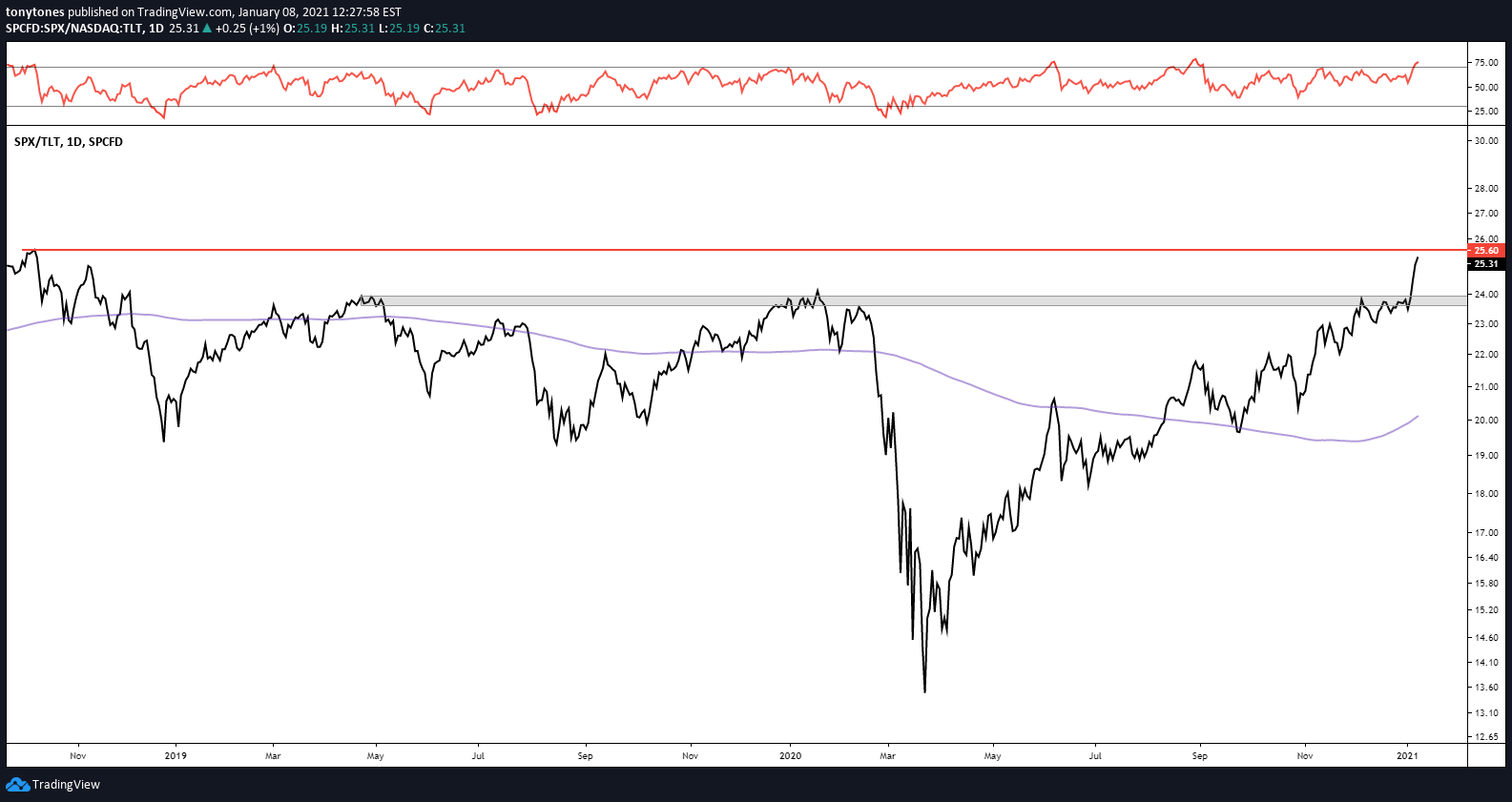
Here’s the ratio of the S&P 500 ($SPX) versus U.S. 20+-Year Treasuries ($TLT): Breaking above the pre-COVID highs and targeting the all-time highs (“ATHs”) from late 2018. The bias is towards equities as long as we are above those prior highs.
S&P 500 ($SPX) versus Gold ($GLD): Holding above long-term resistance and breaking out from the descending trendline all the way back from late 2018.
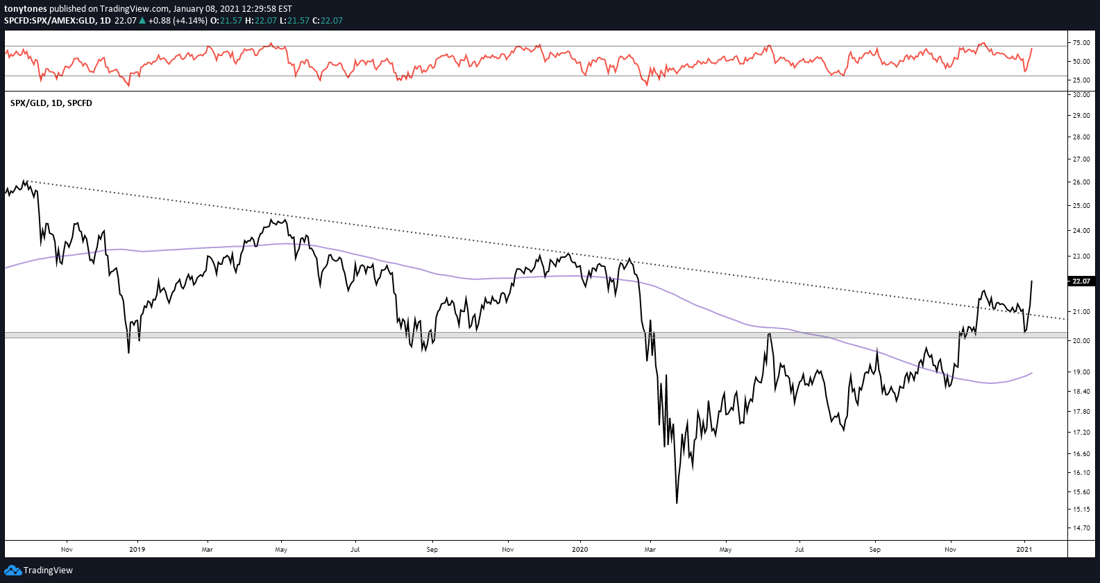
Ultimately, the S&P 500 ($SPX) is at the higher end of its range and should target $3,957 next.
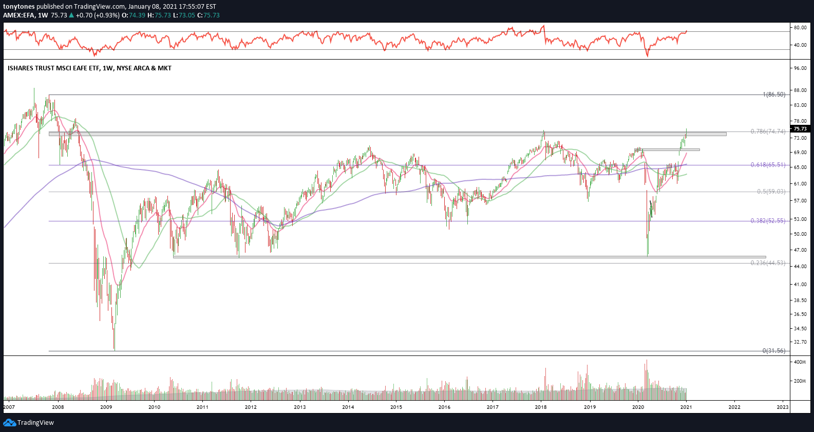
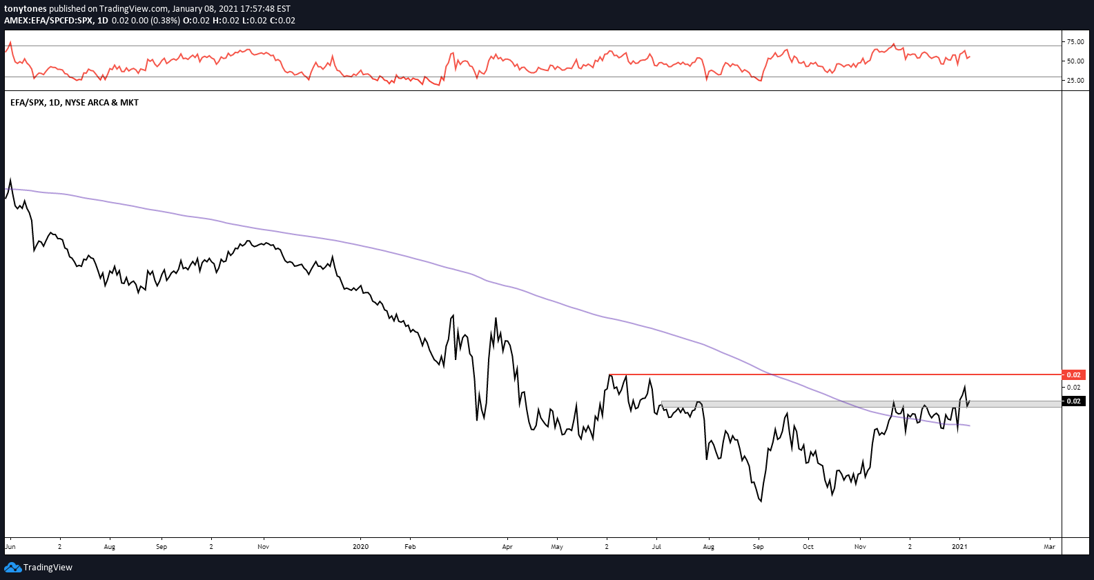
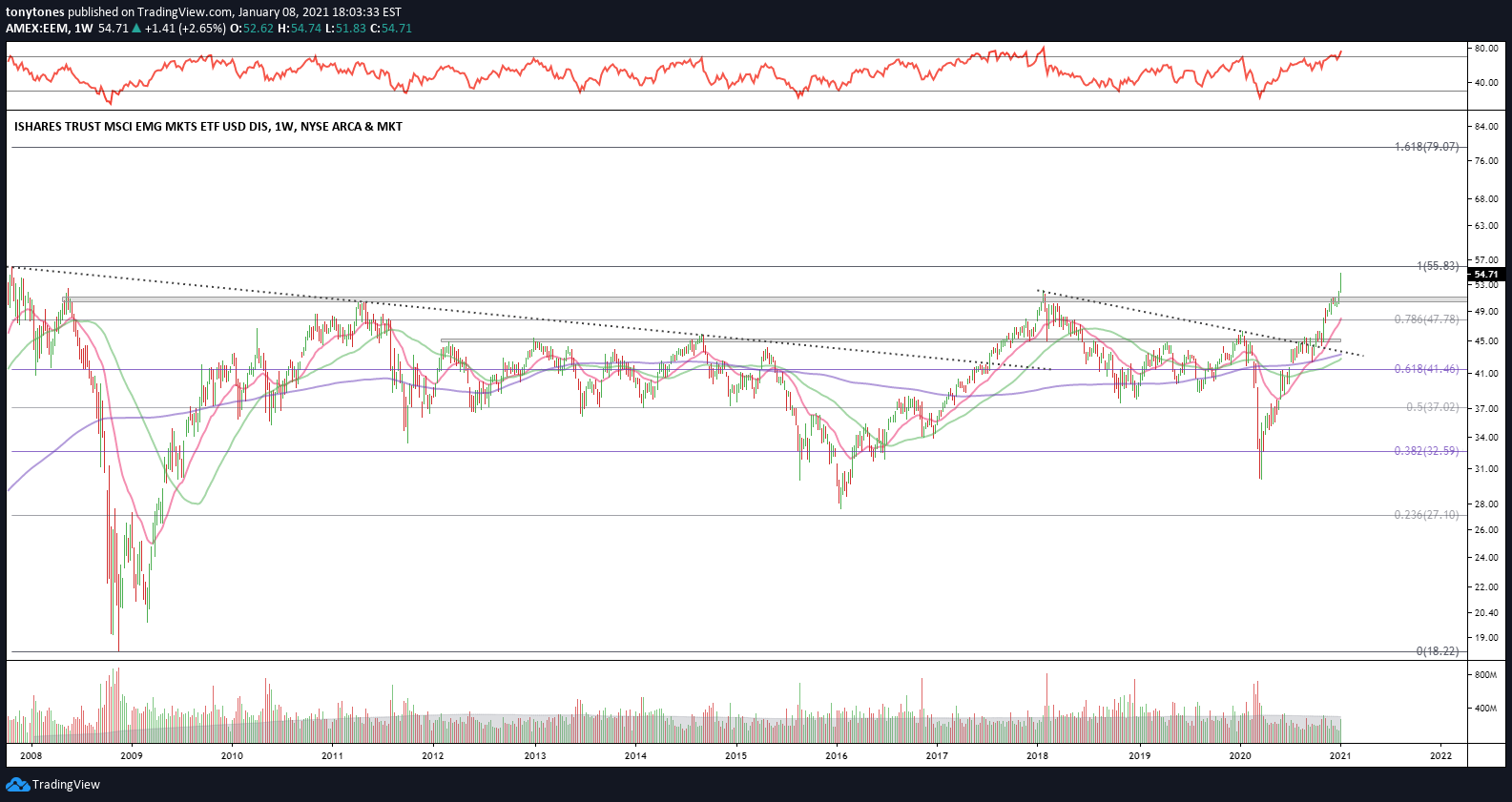
International — From the look of things, International Developed Markets ($EFA) and Emerging Markets ($EEM) are attempting to end their decade of serial underperformance versus the U.S. Keep an eye on these two.
International Developed Markets ($EFA): These stocks have returned less than zero since the 2008 Financial Crisis and are just now breaking out above their early 2018 highs. Above $75, the index has room to target $86.5. The ratio versus $SPX topped out in late 2007 and never looked back. With a strong positive RSI momentum divergence and the ratio attempting to carve out a bottom, is this time different?
Emerging Markets ($EEM): Quite the base on its chart below — underwater since the 2008 Financial Crisis and are just now breaking out above their early 2018 highs targeting ATHs. $EEM targets $55.8 with $79 next on a sustained breakout. The ratio versus $SPX topped out in late 2010 and has had a few false starts ever since. I think this ratio is more constructive than $EFA and could just be getting started.

Fixed income & rates:
The various fixed income markets seems to indicate a few things — higher Treasury yields and a steepening yield curve, higher expected inflation as well as a bias to credit over safety. Note, higher yields are generally bearish for bonds.
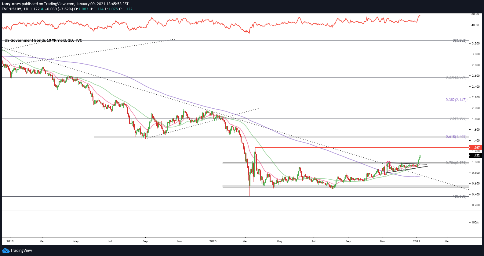
U.S 10-Year Treasury Rate ($US10Y): Following a few weeks outside of the descending trendline, U.S. 10Y Treasuries have finally broken out of the symmetrical triangle and above the critical 0.98% level. If that level holds I think we can see 1.26%, followed by a potential move towards the major 1.46% level. The various rates-proxy ratios charts also indicate a similar bias.
U.S 10-Year Treasury Rate ($US10Y):
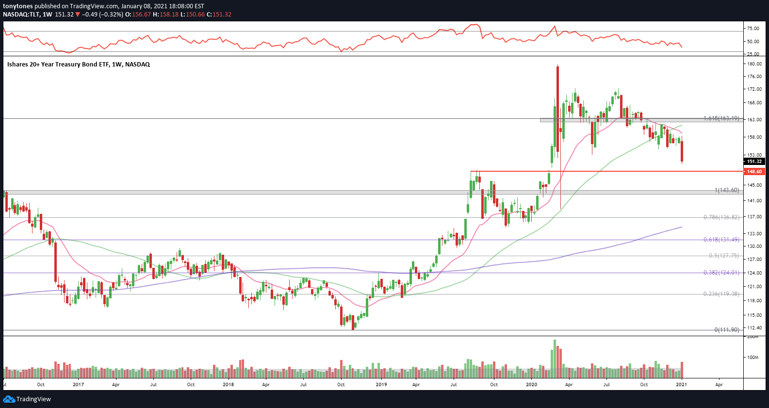
U.S. 20+-Year Treasuries ($TLT): Just yuck.
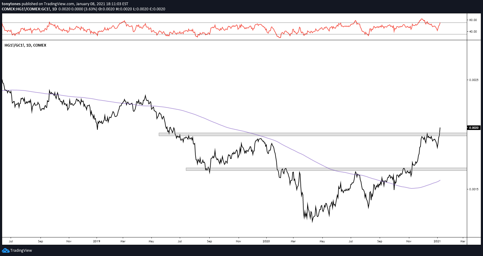
Copper Futures ($HG1!) versus Gold Futures ($GC1!): Higher ratio implies higher Treasury rates.
Regional Banks ($KRE) versus Real Estate ($VNQ): Higher ratio implies higher Treasury rates.

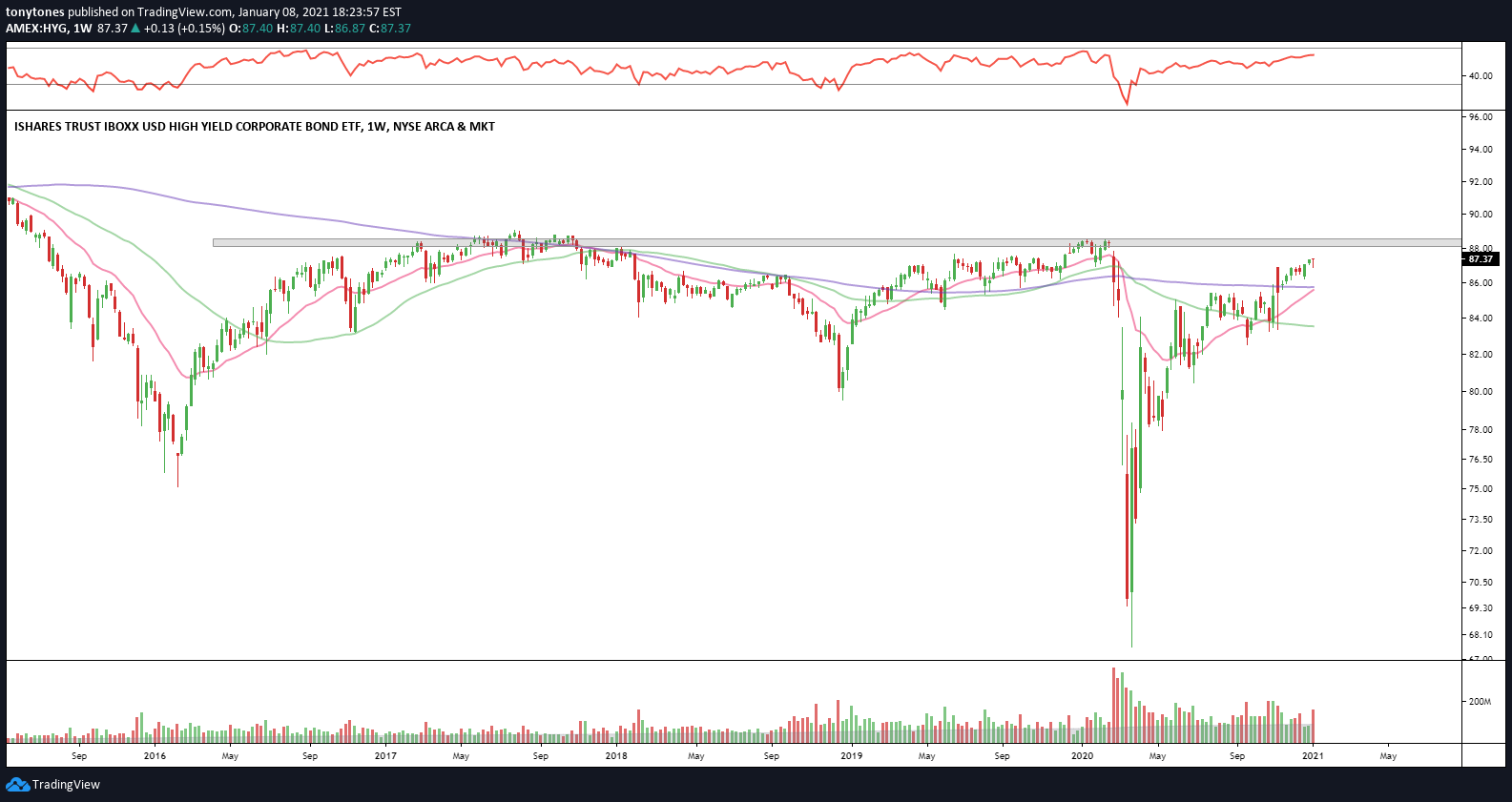
Investment Grade ($LQD) & High-Yield ($HYG) Bonds: COVID-19 was quite scary for credit investors but $LQD and $HYG have rallied strongly since with a little (Herculean) effort from Jerome Powell. With improving relative strength and a lower duration (3.3 versus 9.5) relative to $LQD, $HYG looks like the better choice between the two.
Investment Grade Bonds ($LQD):

High-Yield Bonds ($HYG): Still below 2017 and pre-COVID highs.
High-Yield ($HYG) versus Investment Grade ($LQD) Bonds:

High-Yield ($HYG) versus U.S. 7-10 Year Treasury ($IEI) Bonds:

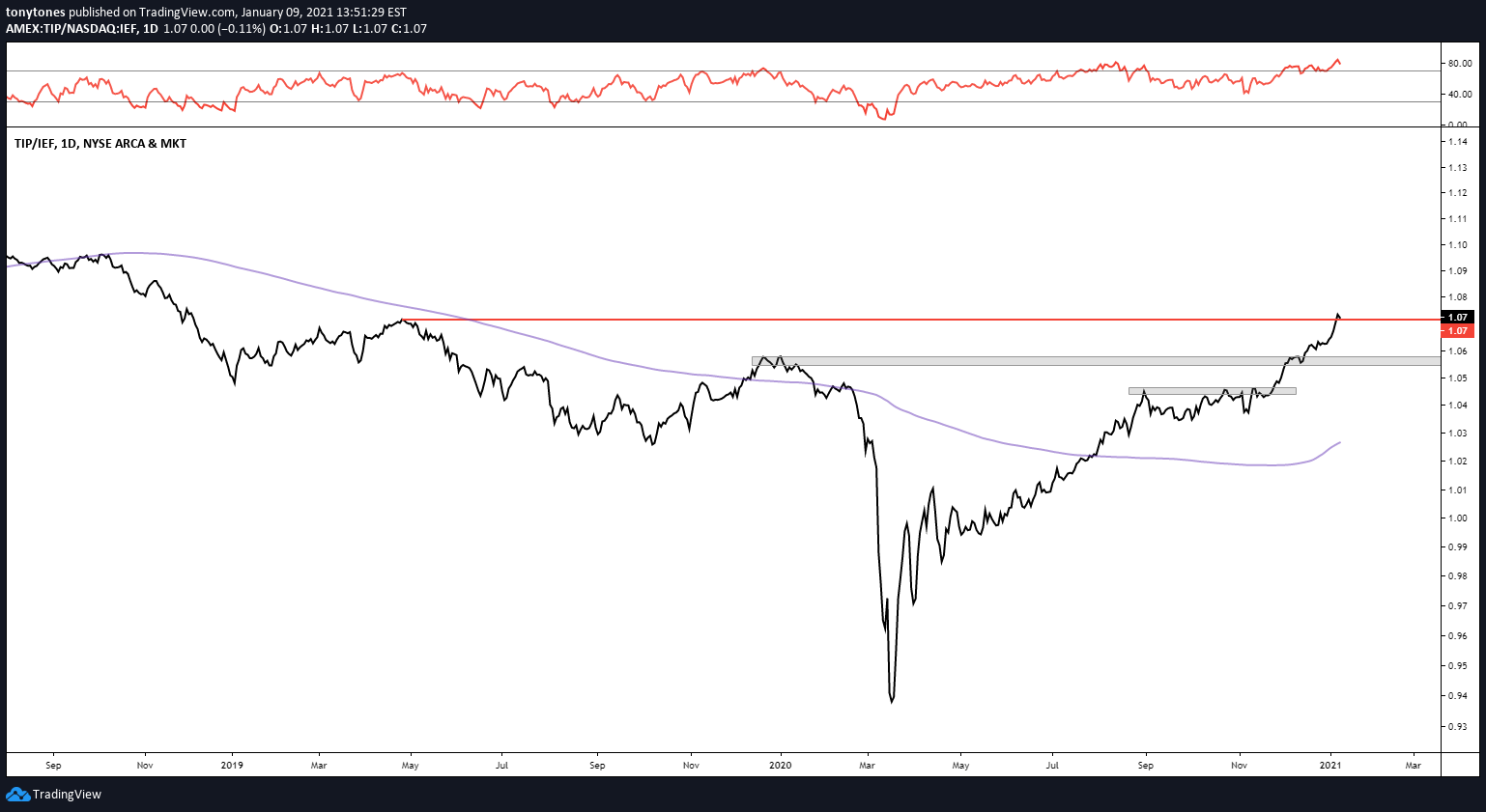
Inflation-Protected U.S. Treasuries ($TIP): Although fixed income appears to be out of favor in general, $TIP looks like the best tranche of the U.S. Treasury market to allocate to on a relative basis. Take a peak at the commodities charts below to get a better picture.
Inflation-Protected U.S. Treasuries ($TIP) versus ($IEF) Bonds:
Commodities:
CRB CoreCommodity Index ($TRJEFFCRB): The commodities basket has had quite the run off the pandemic lows. While still in a longer term downtrend at the moment, the basket overtook the early 2016 lows during the holidays and started 2021 strong moving above resistance from the mid-’17, late 2018 and mid-’19 lows. The bias is higher above $166.6.

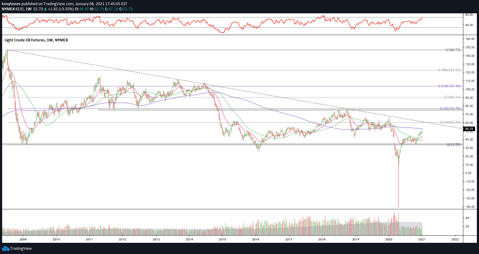
Crude Oil Futures ($CL1!): After trading to an absurd -$40/barrel in 2020, crude oil futures are back above the critical 2008 Financial Crisis and 2016 manufacturing recession lows. Look to target $60/barrel and the descending trendline from the ‘08 meltdown.
Dr. Copper ($HG1!): Dr. Copper, credited for its ability to diagnose the global economy, broke out of its decade-long downtrend in the fall of 2020 and really never looked back. Above the critical 0.618 Fibonacci retracement of $3.613 the futures contract has its eyes set on $4. Put the Doctor down as a point for the bulls.

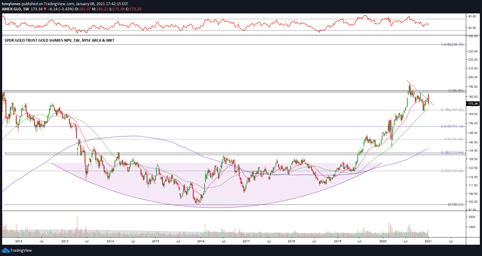
Gold ($GLD): Talk about a frustrating trade since it decisively broke out to ATHs last summer. The pet rock has gone nowhere since and has provided tons of volatility while Bitcoin skyrockets to Mars. It’s a chopfest for now but if $GLD can manage to recapture $186 I think it has $239 written all over it.
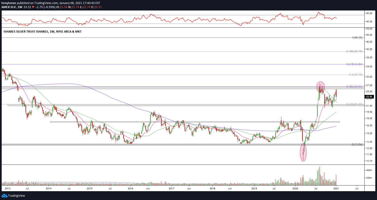
Silver ($SLV): Similar story to its big brother, $GLD. Fits and starts since the summer. Above $26.5 I’d be quite bullish on silver.
Currencies:
U.S. Dollar ($DXY) — Everyone has been massively short the Dollar and smiling since the COVID-19 double top in the index. Rightfully so. Nonetheless, this $DXY level is quite interesting and a short-term reversal here could rain on a few parades (looking at you — EM, commodities). Given the look of other FX pairs, I think the bias is still lower longer term if we are below $89.9.

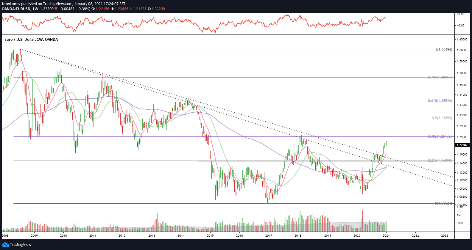
Euro versus U.S Dollar ($EUR/USD): Euro breaking higher relative to the USD.
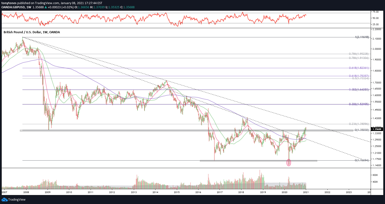
British Pound versus U.S. Dollar ($GBP/USD): Pound breaking higher relative to the USD.
U.S. Dollar versus Canadian Dollar ($USD/CAD): USD breaking lower relative to the CAD.

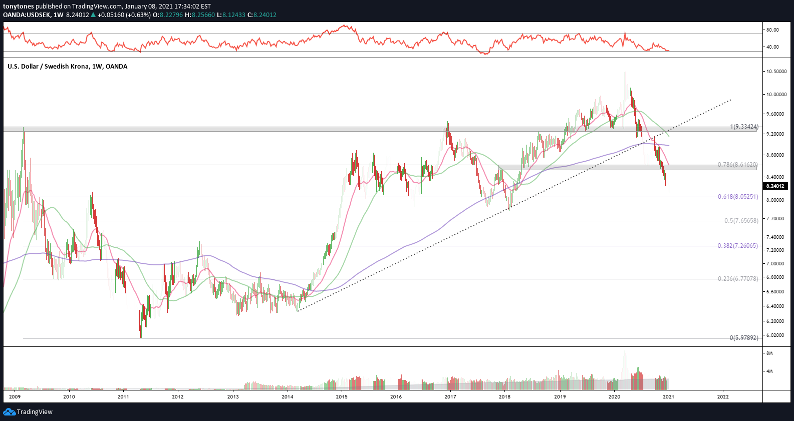
U.S. Dollar versus Swedish Krona ($USD/SEK): USD breaking lower relative to the SEK.
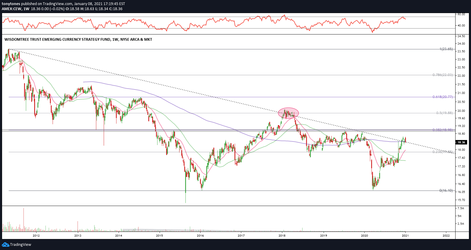
Emerging Market Currencies ($CEW): The EM currencies basket, $CEW remains below the substantial resistance at $19 but is currently testing the long-term downtrend than began in 2011.
Cryptocurrencies:
What an absolute ride the HODLers have had in the past 12 months.
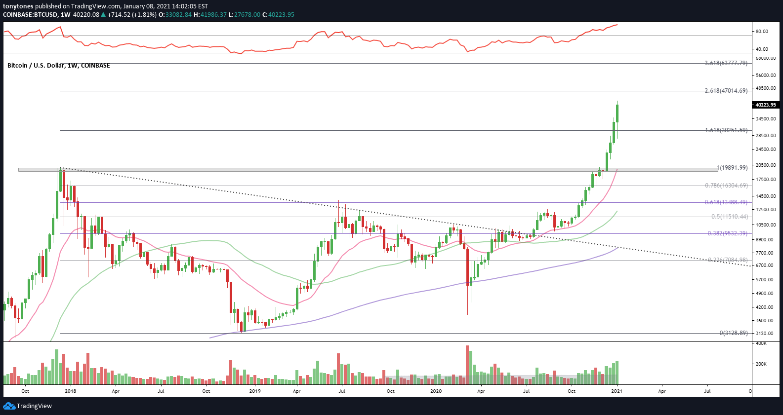
Bitcoin ($BTCUSD) is above prior ATHs as well as it’s 1.618 Fibonacci extension at $30.25K. Next target is $47K. with support at $30.25K. Helmets on, folks.
Vitalik Buterin’s little cousin to Bitcoin, Ethereum ($ETHUSD) was slow to follow but has absolutely skyrocketed in the past two months. First target is ATHs at $1,420 and then $2,248 on a sustained breakout.

A few more ratios…
Ok, so a lot of asset classes not only look positive, they look extremely strong. What else should we watch?
Intermarket analysis is quite useful for locating underlying strength, so I would monitor these relationships to gauge whether investors are leaning more offensive or defensive. Higher levels in these ratios = greater risk-on bias.
S&P 500 ($SPX) versus U.S. 20+-Year Treasuries ($TLT): Shown above.
S&P 500 ($SPX) versus Gold ($GLD): Shown above.
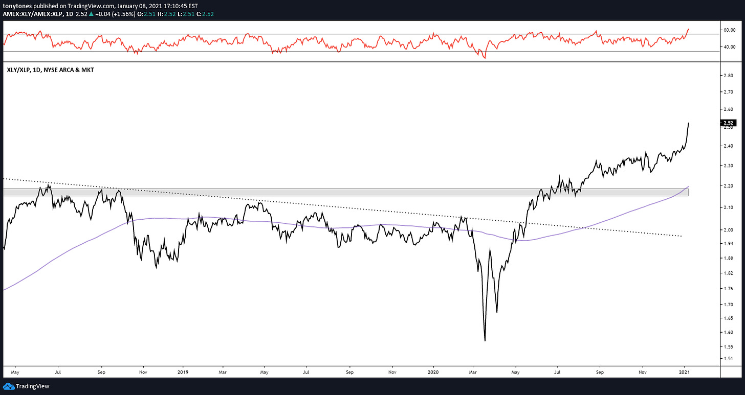
Consumer Discretionary ($XLY) versus Consumer Staples ($XLP): Higher ratio implies greater risk-on bias.
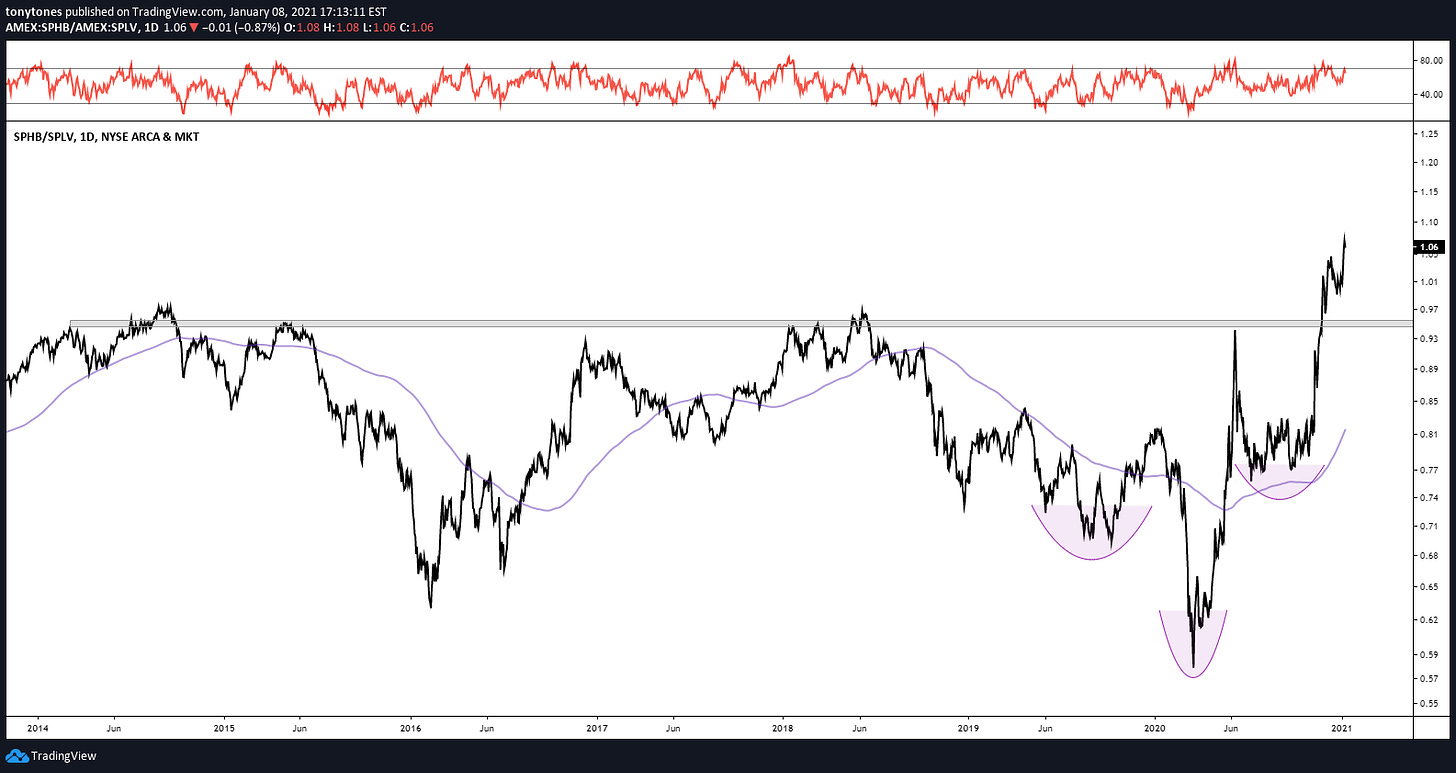
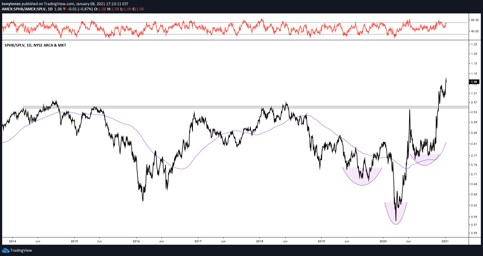
High-Beta ($SPHB) versus Low-Volatility ($SPLV): Higher ratio implies greater risk-on bias.
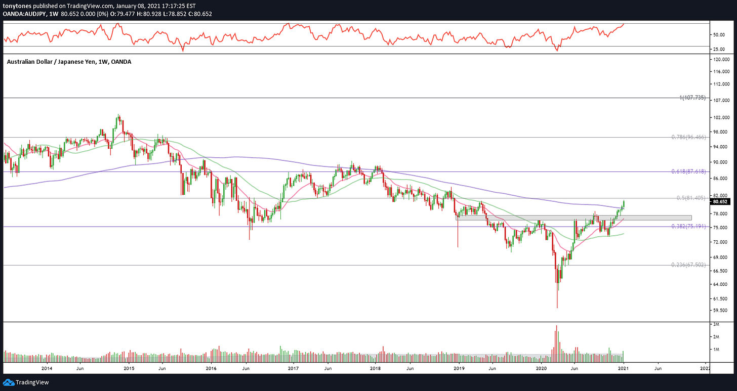
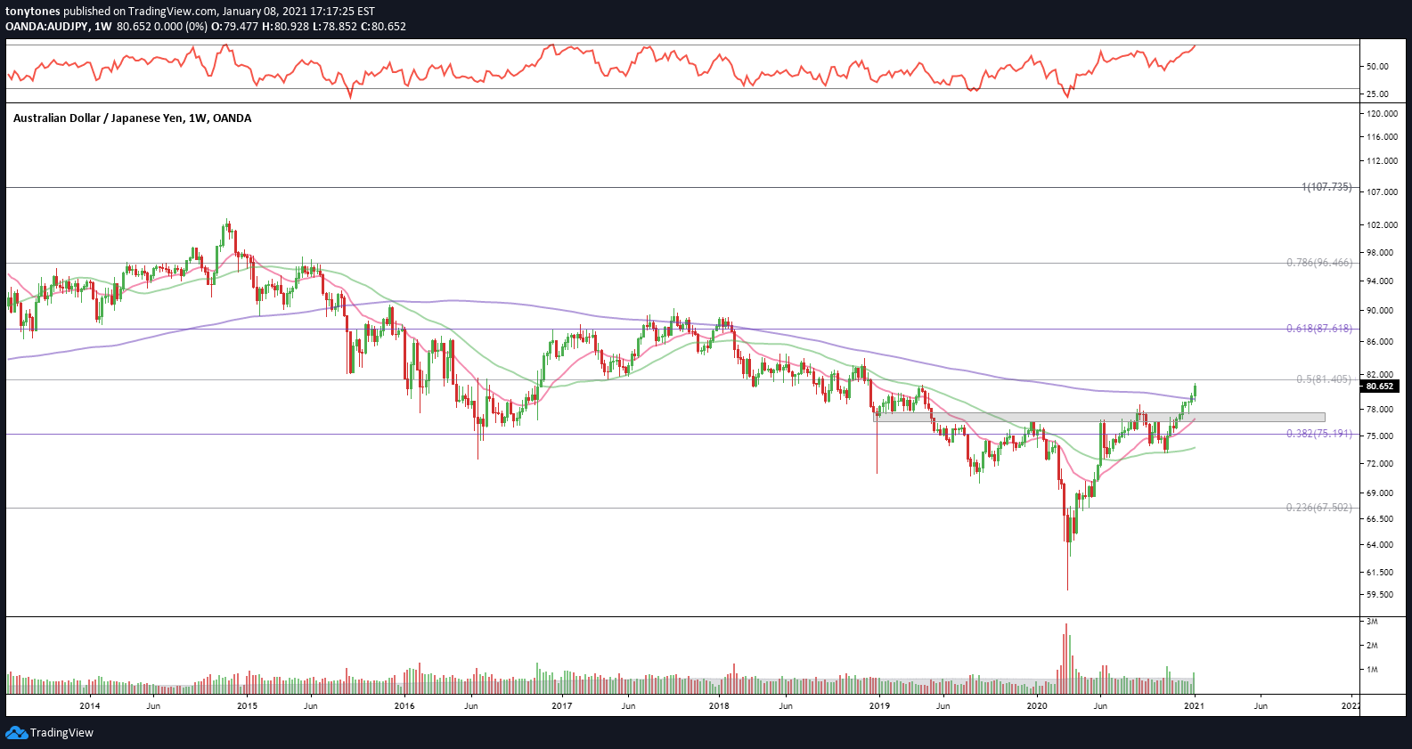
Japanese Yen/Australian Dollar ($JPYAUD): Higher ratio implies greater risk-on bias.
Final Disclaimer: This site is just an easy way to put my thoughts down and show people how I think about and visualize the world’s markets. This is not a blog for investment advice and recommendations.

Very comprehensive and well thought out
Subscribed. Take me to the promised land of gains